Showing posts with label Art. Show all posts

07 January, 2017

Blooming Plant

Minimalism as Less Elements


 Minimalist Image of a Green Blooming plant growing just along the side of a brick pattern wall.
Photo By © Prakash Ghai
Buy Now

Minimalism and Nature is a beautiful Minimalist Photography theme. The more you click such photographs, the better you feel.

Nature Heals !

Hope this year, I will cover more Nature Photographs. I do plan to buy a Canon Macro Lens, and that I am sure would help me in achieving this :)

So What made me click This Blooming Plant Minimalist Photo this particular way?


The slight curved lean of the green plant on the white wall crossed my eye and I stopped right near it. 

Now, the question was, whether to take a vertical shot with just the plant and the white wall, highlighting the curve keeping the photo strictly Minimalist? OR to experiment a little?

I decided to experiment a little. 

Right next to the plant you see this rough brick pattered wall. I initially thought of taking that as a separate Minimalist Shot, but then, I improvised and merged the two Shots that had crossed my mind. 

The result is the above Minimalist Photograph of the Blooming Plant.


The plant was kept to the left of the frame in the corner, following the "Rule of Thirds". The bricks were kept to the right. 

Note, how the empty plain white wall acts as an opposite, to the fully covered rough brick wall. 

That, also added to the Art Element and Aesthetics of the Photograph.

As for the Minimalism classification, The photograph falls under the Minimalism as Less Elements Category of Minimalist Photography. The only elements being a) The Blooming Plant and b) The Brick Patterned Wall

Hope you enjoyed the post.

Stay tuned for more. :)

16 June, 2016

Grainy Minimalism Arcs within Arcs

Minimalism as Less Elements


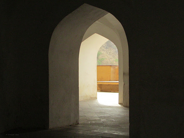
Minimalist Photo of Arcs within Arcs shot at Amber fort Jaipur
Photo By © Prakash Ghai
Buy Now

A Minimalist Photo of Arcs within Arcs shot at Amber Fort, Jaipur


With this Grainy Minimalist Photo I want to make a point. But first, let me Ask you a Question.

Tell me, Why any Artist who paints or draws anything is acceptable art?

Whereas, If a Photographer experiments too much and crosses certain technical boundaries, then his work becomes unacceptable and it is quickly disregarded by people

Why the bias?  Isn't Photography Art too? Isn't the Man/Woman behind the camera, an artist as well?

An artist can doodle, make a collage, scribble, produce abstract artworks or do what ever he or she likes, But a Photographer has to follow certain rules or else people start saying things like "This is not Photography."

Most leading magazines, Photography competitions, stock photography websites, mostly do not accept photos that have grain, blur and other technical errors in them, whether on purpose or not on purpose. 

My question is, why not? 

Sometimes with grains and blur the photos look brilliant but since they do not fall under the technical bracket of "right photography", either such photos get mostly rejected by the Top Photographers/Editors etc. or the photographer himself deletes them, and later never produce newer ones.

What most Top Magazine Editors/Stock Photography site/Photography Jury/Mentors always select and promote is the same old Landscape pictures that include waterfalls, sunsets etc. 
HOW BORING is that? where is the variety? There isn't any.

(Note: In the art fraternity grainy and blurry photos are appreciated to some extent but it still needs a wider audience. On the other hand, in commercial photography, it is almost a complete NO.)

So, The Million Dollar Question is:

"Why is Photography mostly judged on the technical aspects rather than the artistic aspects?"

For example, In photography it is generally recommended that one should almost never take a shot above the ISO setting range of 400-800 in a Crop Sensor camera. If there is low light and if you don't have an expensive camera that gives less grain on high ISO setting, then you lose the shot. Photographers miss many great compositions because of this. They know even if they take the shot at a high ISO setting to capture the composition, everyone's first reaction would be "No, the ISO is too high. so many grains in the photo, forget about the composition, the shot is over."

Then to follow up, they end up recommending you a high priced full-frame camera which might eat up an entire year of your savings.

My problem is with their reaction. Their ideal reaction should be "Wow, what a lovely composition. Forget about the grains. Composition rules, you have a great vision. Well done."

But, this never happens. So what I have personally noticed is that the photographers who can afford the expensive cameras, always tend to suppress the creative photographers who can compose good shots but do not have the resources to upgrade to better cameras. The de-motivation eventually pushes the creative photographer out and that is the reason we keep seeing sunset, sunrises, mountains, waterfall photos over and over and over again.

Anyways, this could go on and on but by now, I am sure you understood the point I wanted to make. 

Back to the Minimalist Photograph 

The shot falls under the Minimalism as Less Elements category of Minimalist Photography. The only subject here is the White Arcs in Repetition. 

The grains add the artistic touch to the photo and that is the highlight of the shot. Without the grains, the photo loses most of its appeal. I had this shot in my PC for over 1 and a half years, but I never posted it on my website/blog because it had grains, I too was not sure of it initially. I kept the shot saved because I believed the composition was decent. Now, when I looked at it today, I felt like posting this and making a point.  

To concluded I would say "Art is art, the medium can be anything and people should value the photographers expression and vision."

Grains are Good - Happy Clicking !

Note: If you have captured some Grainy Minimalist Photographs or any grainy Photographs, post them in the comments section. IF you can't post them maybe share a link or two. I would be happy to take a look at your creativity. 

20 March, 2015

Geometry in the Sky

Minimalism as Simple Geometry


A minimalist photo of Sky high geometric lines at Jaleb Chowk Jaipur.
Photo By © Prakash Ghai
Buy Now

While I was standing near this heritage structure at Jaleb Chowk Jaipur, a local policeman approached me and asked me what was I clicking? He looked very confused as I was pointing the camera at strange places in the sky and at blank walls. He looked at me with suspicion and I quickly read his name written on the small piece of name plate clipped to his shirt. It read "Ram Kumar Yadav". I told him Yadav ji, don't worry I am not from the media. I told him so, as I thought that his fear was that I am probably from the media and I would make a report as to how dirty the place was with garbage lying here and there. To my surprise his reply was "Even if you were from the media, you could do nothing, as we are policemen." I realized, this man was not in the right mood and it was time to lighten up the discussion and move ahead. So, I changed the topic to tourism and asked him what is the government's plan for the upcoming Night Tourism in the city. While talking, I cracked a little joke in between and moved on. I narrated this incident because, as a photographer you should know how to handle little incidents like this, you should know how to lighten up things. If you get into an argument with someone on the street, you shall not remain in a good mood anymore to click. Especially if you are minimalist, you will quickly lose the connect with your sub-conscious mind and wont be able to spot Minimalist Subjects.

Coming back to the Composition, I wanted to show lines here, using just two colors i.e yellow and blue in the frame. The challenge was to keep everything in focus. I used an f stop of F/11 and focused on the black triangle on the left, thereby leaving everything behind also be in focus. The wall on the right wasn't that sharp and to do away with that little blur I added some bit of sharpness to it using a photo editing software.

14 September, 2014

Little Steps

Minimalism as Simple Geometry 


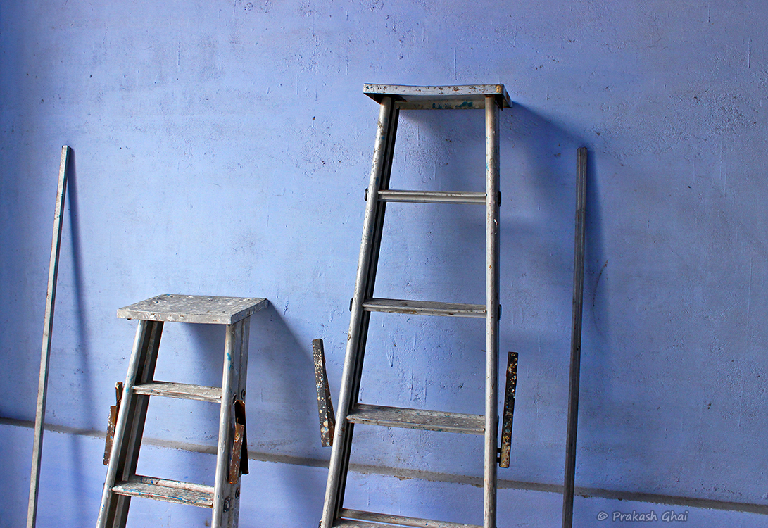
This was shot at Diggi Palace - Jaipur during the annual "Literature Festival". I bypassed all the areas where there were people and headed straight to the backyard. I was really very lucky to have spotted this wonderful arrangement of ladders. The photo is all about "Lines" i.e. simple geometry here. The special blue wall and the light coming from the big open gate from the left, enhanced the visual composition beautifully. I could have taken this shot from the front, but to add a bit of perspective to the image, I took it a little from the side. At the same time, I also made use of the diagonal line coming in from the left, and making it end towards the bottom right of the frame. This, along with the slight off center position, makes the photo look very different than normal.

A Minimalist Photo of Metal Ladders at Diggi Palace Jaipur Literature Art Festival, against a blue wall.
Photo by © Prakash Ghai - Buy Now

07 September, 2014

Rank Opposites

Minimalism as Less Elements 


A Black and white Minimalist Photo of two Earthen clay art hanging on a wall by a thread.
Photo by © Prakash Ghai
Buy Now

A Black and White Minimalist Photo of two Earthen Clay Utensils, hanging on a wall with threads at an Art Exhibition at JKK Jaipur.


I was on a visit to an Earthen Clay Art Exhibition at Jawahar Kala Kendra (Art Center) - Jaipur.  I thought it would be really interesting to see the talent of clay artists and to interact with them to find out how they go about composing or creating their pieces. Also, what goes into the preparations and understanding the entire creation process.

I did interact with a very artists and I was amazed to find out about their wonderful creative minds. While I was going around artwork to artwork inside the Exhibition Hall, I stopped over at this fairly simple clay structures that looked very Minimalist in terms of design. The artist that made the structure was not available at that time. 

What I found interesting here was the opposite placement of the Clay Artwork. One was front faced and the other one was facing the wall. I new right that very moment that I had an opportunity to capture a nice Black and White Minimalist Photograph of this subject. After 2 shots I got what I wanted.

The Photograph falls under Minimalism as Less Elements Category of Minimalist Photography, to learn more about other Types of Minimalism click here: 8 Types of Minimalism

Thank You

Have a Nice Day!

06 September, 2014

Intrinsic Value

Minimalism as Less Elements

A Minimalist Photo of Elongated shadow of drainage pipe supported by a vertical rectangle
Photo by © Prakash Ghai
Buy Now

A Minimalist Photo composed by using the elongated shadow of drainage pipe, as a subject. The shadow being accompanied by a vertical rectangle.


Sometimes, people fail to realize that they have far more potential hidden within them, than what they actually believe they have. This is depicted in the Minimalist Photo by the elongated shadow of the small pipe signifying( or the person), the huge potential hidden within them or their intrinsic value. They may or may not be aware of it. Most of us do not know our full potential. It is important to keep exploring and trying new ventures. That is one of the ways to find out.

More on the Minimal Composition


The main subject of the photo is the cylindrical pipe, which is complimented by the vertical rectangle on the right hand side. Some grains on the right and the smooth surface on the left, acts as opposite textures. Keeping the frame vertical, helped me to keep the long shadow of the pipe well within the frame. I kept this Black and White as that just makes the shadow look even more dramatic and there are plenty of people who really like Black and White Minimalist Photography.

Hope you enjoyed the Photograph. Stay tuned for more.

Looking for some Minimalist Wall Decor?
Head over to the page Buy Minimalist Photos

02 September, 2014

Juxtaposition: Geometry Vs Abstract form

Minimalism as Simple Geometry

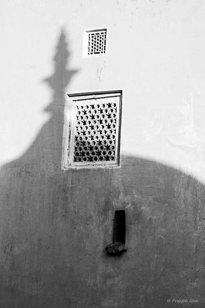
A Monochrome Minimalist Photograph of the abstract form/ shadow of the round dome versus geometrical shapes at Amer Fort, Jaipur
Photo by © Prakash Ghai
Buy Now

A Monochrome Minimalist Photograph of the abstract form/shadow of the round dome versus geometrical shapes at Amer Fort, Jaipur


The Juxtaposition between Simple Geometric shapes i.e rectangles and the Abstract shadow/shape  the "Gol Gumbad" or the Round Dome(in English) is shown here.

Wow, that was long and confusing, isn't it? Sometimes, my head just spins while taking such tricky Minimalist Photographs. I try so many different shots and angles and at times I end up erasing all photos of a particular shot/subject and start all over again. This did not happen this time around as finally, I got what I was looking for.

What caught my attention, was the overlapping shadow of the Gumbad on the second rectangle and the way it was curving down to the right. Initially, the shadow flirted for a while with the vertical line of the rectangle but she, probably was not interested and therefore the shadow slipped down further to the right. The key to the shot was, placing right the two rectangles, that's it. Once I did that, I moved a little to the left and the to the right, for adjustment and bang everything was perfect.

Hope you enjoyed the photograph. 

To buy framed prints of my work hear over to: Buy Minimalist Photos